Formatting Charts
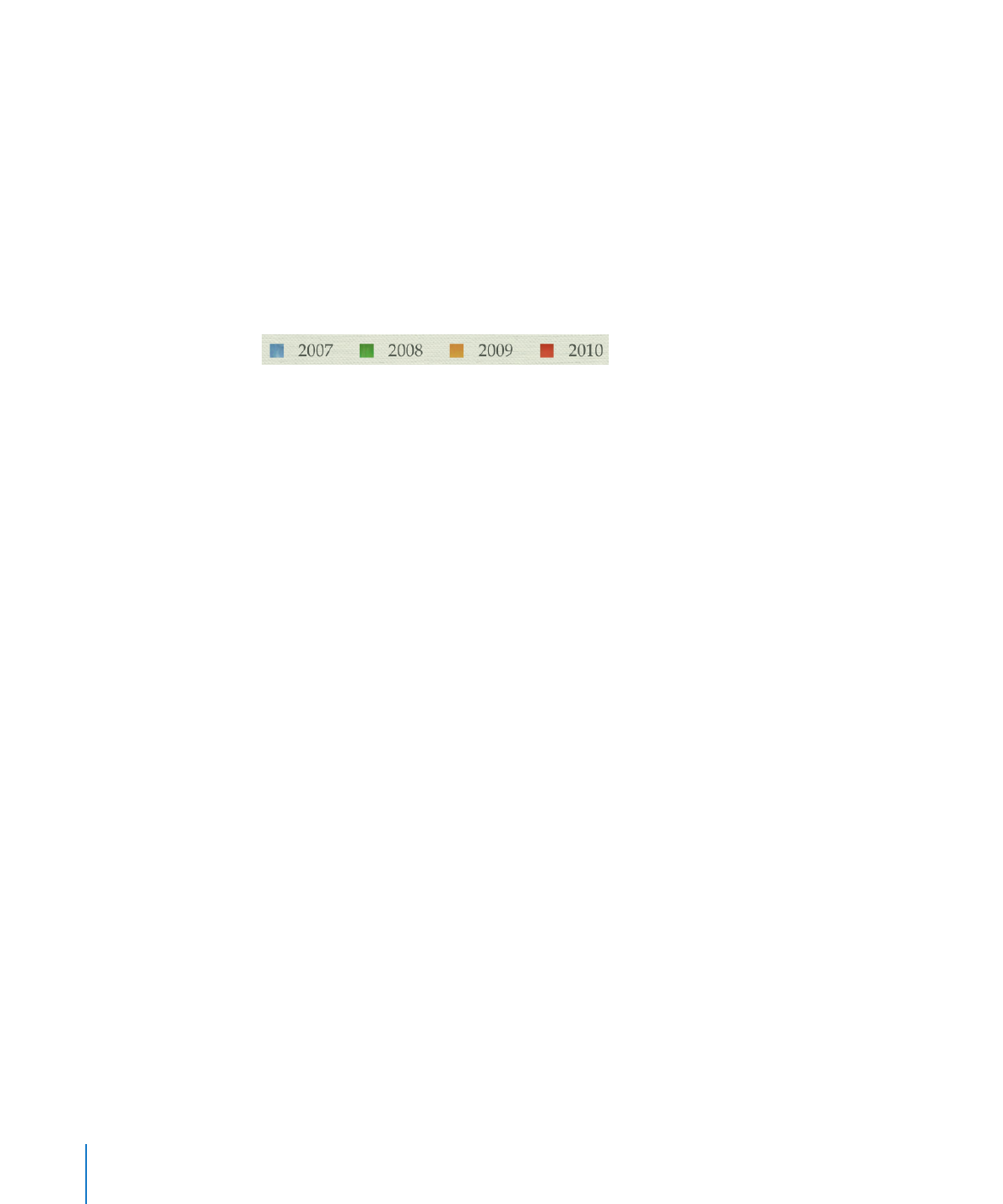
Every chart you create has an associated title, chart legend, and labels that you can
choose to show or hide in your slideshow or change their look and placement on the
slide. You can also change the chart colors and textures, the axis scales and tick marks,
and the data point labels within the chart. You can rotate 2D charts and adjust the
angle and lighting style used in 3D charts.

Many of the instructions given here give details for performing tasks using the Chart
inspector. But many of these task steps can also be performed using the format bar.
The options in the format bar change, depending on what item you have selected on
the canvas, always providing you with appropriate formatting options.
To place additional labels or captions on a chart, add a free text box. To learn how, see
“Adding a Free Text Box” on page 61.