Keynote Tools and Techniques

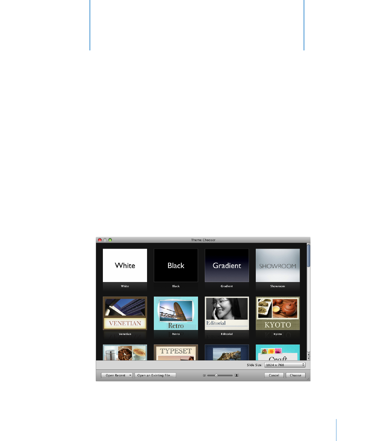
Each theme comprises a family of master slides with coordinated design elements that
create a look and feel based on preselected fonts, backgrounds, textures, table styles,
chart colors, and more. You begin creating a Keynote document by selecting a theme
to work in. This means that each time you add, for example, a new text box, shape, or
chart, to a slide within that theme, its colors and styles are coordinated with the rest of
your slideshow.
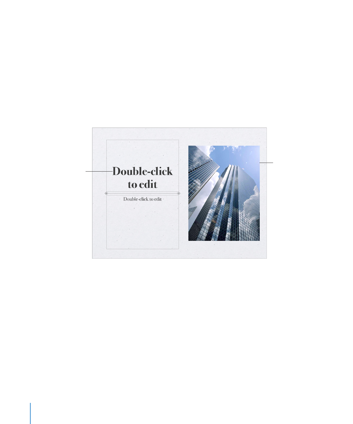
Master slides provide different layouts of text and images that match the look and feel
of their themes. When you want to create a slide with particular elements—such as a
title and subtitle, a bulleted list, or an image—you select the master slide that most
resembles the layout you want. Master slides contain placeholders for text and images,
which you replace with your own content as you construct your slideshow.
Placeholder text
Media placeholder
for images, movies, or
other media files
Media placeholders contain photographs that you can replace with your own
photos, PDFs, or movies. Drag your own image or movie to the placeholder to have
it automatically sized, positioned, and framed to fit the slide. You can drag media
to any position on the slide (not only to media placeholders), but it won’t inherit
the attributes (size, frame, and so on) of the placeholder image. To learn more, see
“Replacing Theme Images with Your Own Media” on page 75.
Placeholder text appears in title and body text boxes on each new slide with the
instructions “Double-click to edit.” Its appearance demonstrates what your own text
will look like after you’ve typed it into the text box. In body text boxes, the bullet that
appears will be the same that will appear next to your own text. To learn more, see
“Formatting Text Size and Appearance” on page 50.
As you create a slideshow, you can add other elements, such as tables, text boxes,
shapes, and other objects, to any slide.
14
Chapter 1
Keynote Tools and Techniques

Chapter 1
Keynote Tools and Techniques
15
Most themes come with the following master slides:
Master slide
Recommended use
Title & Subtitle
Title slide or section titles within your
presentation
Title & Bullets
Content
Title & Bullets - 2 Column
Content you want to appear side by side
Bullets
General content pages that require bulleted text;
the text area fills the entire slide
Blank
Graphics-rich layouts
Title - Top or Center
Title page or section titles within your
presentation
Photo - Horizontal
Horizontal photo with title below
Photo - Vertical
Vertical photo with title and subtitle on the left
Title, Bullets & Photo
Title page or section title with text and photo
Title & Bullets - Left or Right
Content slides on which you can place bulleted
text on the left or right and a graphic on the
other side of the slide